
LinkedIn has just updated its Analytics features, after announcing earlier this year that modifications would be made.
Last month, we updated our previous article that discussed LinkedIn statistics (available here), but the new Analytics interface was not available at that time as it is being rolled out gradually.
Our first look at the new features reveals some great improvements, most notably a new layout for the statistical data measured by the platform.
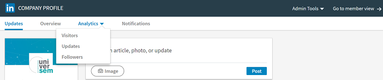
Now referred to as “Analytics”, the service has been split into three sections, each on a different page, where you can view your:
1. Visitors
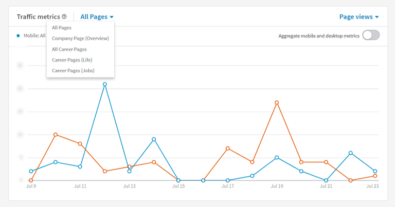
This first section offers you a new set of data which was not available in the previous version of the LinkedIn Analytics tool. Here, you can find more extensive information relating to your visitors, including pages on their Company, Career (jobs) and Career (life).
You can also analyse your traffic by source – Mobile or Desktop – by deactivating the “Aggregate” mode so that it only displays the device type you wish to see.
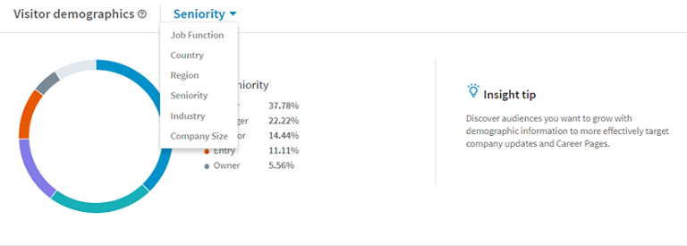
Another new feature is the ability to analyse your visitor demographics, which allows you to identify and segment visitors to your page in different ways. You will notice that LinkedIn has abandoned the use of bar charts in order to display this information in pie chart form, but although this looks more modern, it is slightly harder to read. Still, we welcome the arrival of this new set of data, as well as the little “insight tips” that will help you to better identify the type of audience you wish to target.
2. Updates
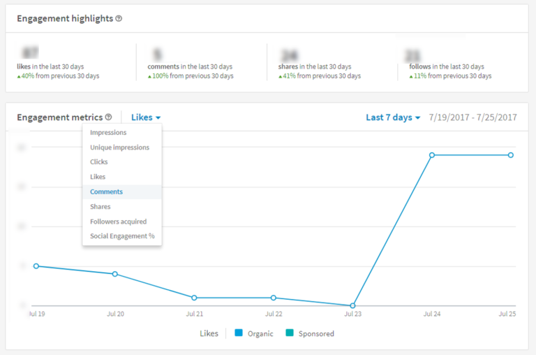
The second section also offers new data that nicely complements the existing panels. It focuses solely on the performance of your publications, so you can use it to monitor your published content throughout a given time period. This data is split into three sections:
- The first focuses on “Engagement Highlights” from the past 30 days, so you can see how your content is performing at a glance.
- The second section shows a results graph for all of your posts within a selected time period. As with the previous version, you can focus on the data you need by isolating the metrics you want to analyse (Impressions, Clicks, Shares, etc.).
- The final section analyses the same data, but broken down for each post. This section has not changed much from the previous version, and generally presents the same information
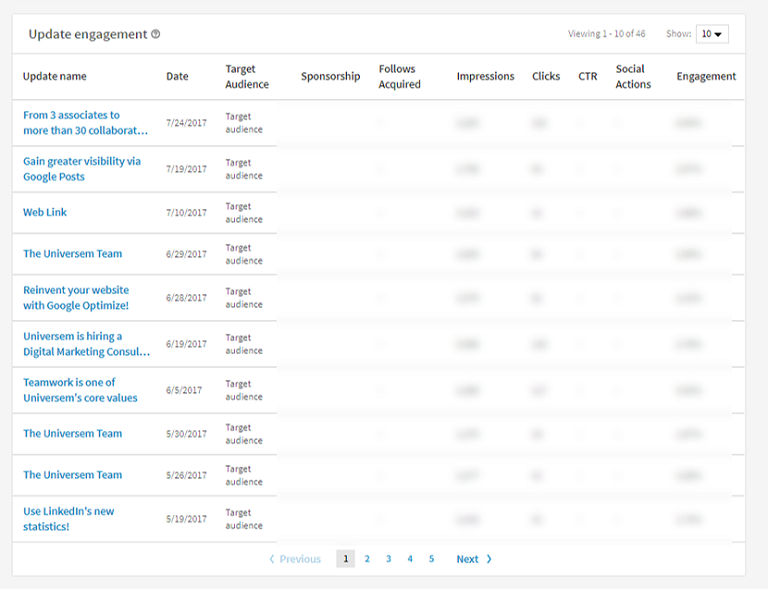
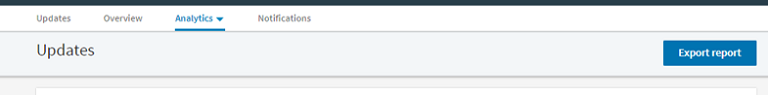
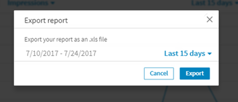
However, this third section can now be exported. A button has been added in the top right-hand corner of the “Updates” section that allows you to download the information in Excel format. Covering the performance results for your publications from the last two months, the report also includes a few useful fields:
- Type of engagement (organic or sponsored)
- Name of the campaign (if you decided to promote your publication)
- Date of organic publication (date it was first published on the platform)
- Date of sponsored publication (date it was first promoted on the platform)
- Campaign start date
- Campaign end date
- Organic audience
- Impressions (presumably a consolidation of organic and sponsored impressions)
- Clicks
- Click-Through Rate
- Total number of interactions
- Number of followers acquired
- Engagement rate
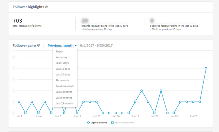
3. Followers
The final section has undergone some great changes and now offers a detailed overview of your followers. Like the Updates section, it displays a “Highlights” block at the top, before concentrating on audience growth. LinkedIn seems to have chosen to focus on “Follower Gains” over “Follower Trends”.
This new display lets you fully analyse the day-to-day growth of your audience, according to its acquisition source (organic or sponsored) and the given time period. This means that you can see if you have lost one or more followers, which wasn’t previously possible.
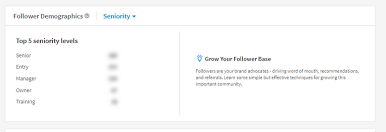
Similar to the Visitors section, you will find a demographic analysis on the third page, where you can identify and define the profile of your followers through different configurations.
The type of information reported is what really makes the difference here. The first setting shows you relative data (in percentages) while the second offers only absolute data (in numbers). For instance, you can find out exactly how many people in senior positions are following your page.
Finally, the “Companies to Track” section replaces the old “How You Compare” feature (which we already covered in our previous article here.). In the previous version of its Analytics tool, LinkedIn automatically selected a series of companies with a similar profile to your organisation and allowed you to view how many followers they had.
This new section is considerably less stingy on the details. First, the list of companies is much longer, and secondly, you can now analyse other performance information from the pages of these “companies to follow”. Apart from how many followers these other companies have, you can also see:
- How their audience has grown;
- The number of new shares;
- The engagements they have generated.
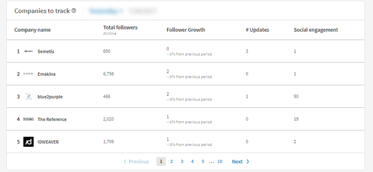
Once again, you can determine the time period for which you wish you analyse this data. The list is automatically created depending on the time period defined and the companies selected.
Moving towards a real dashboard
You will find several similarities between each of the 3 sections, such as a central graph allowing you to analyse the performance of your strategies, all within a given time range.
The demographic data has been enhanced and is displayed in two different categories for ease of understanding.
The “metrics” principle mentioned in our previous article is, of course, still accessible. But with this new interface and the comprehensive data now offered, LinkedIn is moving ever closer to having a full Analytics Dashboard. It has also switched to more user-friendly menus and allows you to perform a simple export of key data (only “Update Engagement” for the moment, but others will probably follow).
Please note: at the time of writing this article, we noticed some inconsistencies in the data provided, but we’re sure that LinkedIn will quickly rectify this glitch.
Want to share your thoughts on this new tool? Then comment below!
